- The EU Accessibility Act has been in force since June 2025, with direct implications for UK businesses selling into EU markets
- The UK Equality Act 2010 applies independently and requires reasonable adjustments for digital accessibility
- Grunge and punk design can pass accessibility tests, but only when built with the right parameters from the start
Quick answer: WCAG compliant design aesthetics are entirely achievable within grunge, punk, and distorted design styles. The key variables are contrast ratios, font legibility at small sizes, animation behaviour for users with reduced motion preferences, and colour combinations that do not rely on hue alone to convey meaning. Rebellious aesthetics and legal compliance are not opposites. They require different decisions at the design stage, not different design directions altogether.
Why 2026 Is the Year UK Design Teams Can No Longer Ignore Accessibility
The European Accessibility Act came into force across EU member states in June 2025. UK businesses that sell products or services into EU markets, including digital products, SaaS platforms, and e-commerce, are subject to its requirements regardless of where they are incorporated. The EAA mandates conformance with EN 301 549, which incorporates WCAG 2.1 Level AA as its baseline technical standard.
Independent of EU obligations, the Equality Act 2010 requires UK organisations to make reasonable adjustments for disabled users across their digital services. WCAG 2.2 Level AA is the recognised benchmark for demonstrating those reasonable adjustments have been made.
- Public sector organisations are already required to comply with WCAG 2.2 AA under the Public Sector Bodies Accessibility Regulations 2018
- Private sector organisations face Equality Act exposure if their digital products create barriers for disabled users
- The question for UK design teams is not whether to comply. It is how to do so without abandoning the visual direction their brand or client demands
That question becomes particularly pressing for brands adopting grunge, punk, distorted cut, and typographic collage aesthetics, all of which were identified as dominant 2026 design directions by agencies including Screaming Frog and Cosanostra.
What WCAG Actually Requires from Visual Design
WCAG is structured around four core principles known as POUR: Perceivable, Operable, Understandable, and Robust. For visual designers working on branding, web, and digital marketing assets, the most directly relevant criteria fall under Perceivable.
Contrast Ratios
- Standard text must achieve a contrast ratio of at least 4.5:1 against its background at Level AA
- Large text (18pt or 14pt bold) requires a minimum ratio of 3:1
- Non-text elements such as icons and UI components must achieve 3:1 contrast against adjacent colours
- Decorative elements that carry no meaning are exempt from contrast requirements
Text Legibility
- Text rendered as an image must meet the same contrast requirements as live text
- Fonts must be readable at their displayed size. Distorted or hand-textured typefaces are not exempt from this requirement
- Users must be able to resize text to 200% without loss of content or function
Colour Independence
- Information cannot be conveyed through colour alone. A red warning label must also include text, an icon, or a pattern to communicate its meaning to users with colour vision deficiency
- This directly affects punk and grunge designs that use colour contrast as the primary communicative device
Animation and Motion
- Animations that last longer than five seconds must be pausable, stoppable, or hideable
- Content that flashes more than three times per second violates WCAG regardless of design intent
- The reduced motion OS preference must be respected in web and app contexts
The Contrast Ratio Test: A Practical Guide for Grunge Palettes
The most common failure point in grunge and punk design is contrast ratio. The aesthetic often relies on deliberate visual tension: dark on dark, muted tones colliding, or washed-out vintage palettes. However, none of these directions are inherently incompatible with WCAG compliant design aesthetics. They become inaccessible only when the ratio between foreground and background color falls below the WCAG threshold.
The contrast ratio is calculated from the relative luminance of the two colors being compared. A 1:1 ratio is no contrast at all. A ratio of 21:1 is pure black on pure white. The 4.5:1 threshold for standard text is the point at which the majority of users, including those with moderate low vision, can reliably distinguish text from its background.
- Black text on a deep red background: contrast ratio typically between 5:1 and 7:1. Often passes AA
- Yellow text on black: typically between 14:1 and 19:1. Well above AA threshold
- White text on mid-grey: often between 3:1 and 4:1. Frequently fails at standard text sizes
- Washed green on cream: often below 2:1. Fails AA for all text sizes
The practical approach is to run every proposed color pairing through a contrast checker at the design stage, not at the audit stage. Retrofitting contrast compliance after a full design system has been built is significantly more expensive and disruptive than building with compliance from the beginning.
For UK businesses that want to understand how accessibility compliance intersects with their broader digital content strategy and search visibility, the principles in A Complete On-Page SEO Checklist to Boost Ranking are directly relevant, since WCAG compliance affects both search indexing and user experience scoring.
Grunge Design Techniques: Which Pass and Which Need Modification
The table below shows common grunge and punk design techniques alongside their accessibility status and the modifications that make them compliant.
Here is the data organized into a clear table:
| Design Technique | WCAG Status | What Makes It Compliant |
| Dark textured background + white headline | Pass (if ratio meets 4.5:1) | Verify contrast ratio using a tool. Most white on dark textures pass at large sizes. |
| Scratched or distressed typeface | Conditional | Must be legible at body size. Use distress as stylistic overlay, not applied to body copy. |
| Low contrast intentional colour palette | Fail at Level AA | Adjust hue or value until AA threshold is met. Punk palettes can still be bold at compliant ratios. |
| Colour-coded navigation with no labels | Fail | Add text labels or icons alongside colour coding to remove colour-only dependency. |
| Strobing or rapidly flashing animation | Fail | Reduce flash frequency to below three per second and add a reduced motion alternative. |
| Torn or collaged layout with overlapping text | Conditional | Primary reading content must have clear background separation. Decorative overlaps are exempt. |
| High contrast black on yellow palette | Pass | Black on yellow typically exceeds 8:1 contrast. One of the most accessible colour pairings available. |
| Hand-written grunge body copy | Fail at small sizes | Restrict distressed type to headlines and display sizes. Use legible typefaces for body and navigation. |
Typography in Grunge Design: How to Keep the Attitude Without Losing the Legibility
Typography is the element most likely to fail accessibility requirements in punk and grunge aesthetics. The visual language of the style relies on distressed letterforms, irregular baselines, overlapping characters, and deliberate legibility tension. The challenge is separating the elements where legibility tension serves a decorative purpose from those where it carries functional meaning.
Display Typography
- Headlines, pull quotes, and large-scale type can absorb significantly more distress, collage treatment, and visual noise than body copy
- At large sizes, even a heavily textured typeface typically maintains sufficient contrast and character distinction to meet WCAG at Level AA
- Test distressed display type by simulating low vision viewing conditions, either with browser zoom tools or accessibility simulation plugins
Body and Navigation Typography
- Body copy and navigation elements must remain legible under all circumstances. No amount of aesthetic rationale overrides the functional requirement for readable text
- Use a clean, accessible typeface for body copy and navigation, and apply the grunge aesthetic through layout, texture, and imagery rather than letterform distortion
- This separation actually strengthens many grunge designs. The collision between a clean body typeface and a distressed headline creates more tension than using the same distressed font throughout
Font Sizing and Spacing
- Users must be able to increase text size to 200% without losing content or function
- Line height, letter spacing, and word spacing must be adjustable without breaking the layout
- Build text containers with flexible sizing rather than fixed pixel heights that clip text when user settings are applied
Accessible Color Palettes That Still Communicate Rebellion
The most persistent myth about accessibility in design is that compliant color palettes must be conservative. They do not. Some of the most visually aggressive color combinations in design history are also some of the most accessible.
- Black and yellow: a combination with deep roots in both punk graphics and hazard communication. Typically achieves contrast ratios well above the AA threshold and works at any text size
- Deep red and white: a combination associated with urgency and aggression that typically passes AA for large text and often for standard text with the right red value
- Electric blue on black: contrast ratios vary significantly by shade. Testing is essential, but many electric blue values achieve 4.5:1 or above on a true black background
- Lime green on black: another high-contrast combination with strong punk and rave associations. Most lime green values achieve very high contrast ratios against black
The approach is to start from the intended emotional response of the colour pairing and then test and adjust the specific values until the ratio passes, rather than starting from a compliant palette and adding aesthetic choices on top. This sequence preserves the design intent while meeting the legal requirement.
Understanding how visual design choices affect the way audiences engage with a brand across social platforms is essential for Social Media Marketing For Businesses, which addresses how design decisions translate to performance across different channel contexts.
Animation and Motion in Grunge Aesthetics: The Reduced Motion Problem
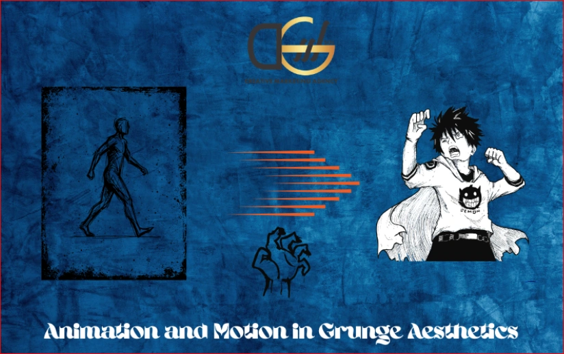
Grunge and punk aesthetics increasingly incorporate motion: glitch effects, VHS scan lines, flickering text animations, and camera shake transitions. Each of these creates specific accessibility considerations under WCAG 2.1 and the broader EAA requirements.
Flash Rate
- Any content that flashes more than three times per second violates WCAG Success Criterion 2.3.1
- This applies to glitch effects, rapid flicker animations, and strobe transitions within web and app contexts
- Reducing the flash rate to two per second or below removes the photosensitive trigger without necessarily removing the aesthetic effect
Respecting Reduced Motion Preferences
- Operating systems including macOS, Windows, iOS, and Android allow users to set a reduced motion system preference
- Web and app animations must detect this preference via the prefers-reduced-motion CSS media query and either remove or substitute the animation
- The substitute does not need to be a still frame. A slower, gentler version of the same animation can satisfy the requirement while preserving some of the visual character
Looping and Auto-Playing Content
- Any looping animation or video that plays automatically and lasts longer than five seconds must include pause, stop, or hide controls
- This applies to animated backgrounds, hero section loops, and digital signage content when displayed in interactive web contexts
Building Rebellious Brands That Comply: Where DGSOL UK Fits In
Most UK design agencies approach accessibility and aesthetics as separate workstreams. Accessibility is addressed during the audit stage, after the design is complete, typically by a different team. The result is a compliance process that retrofits requirements onto a design that was not built to accommodate them.
DGSOL works with brands across the UK that want bold, attitude-driven visual identities without the legal and reputational risk of non-compliance. The approach integrates contrast testing, typography legibility requirements, and motion accessibility standards into the design process from the concept stage, not as a final layer of remediation.
For marketing and legal teams at UK businesses navigating the pressures of the EU Accessibility Act alongside a genuine desire for distinctive, rebellious branding, DGSOL UK provides a bridge between creative ambition and technical compliance.
Conclusion
WCAG compliant design aesthetics are not a creative constraint. They are a design discipline that most agencies have yet to integrate into the visual identity and campaign production processes. Grunge, punk, distorted cut, and typographic collage aesthetics are entirely compatible with Level AA compliance when contrast ratios are tested at the design stage, typographic distress is reserved for display contexts rather than body copy, animation flash rates stay below three per second, and colour combinations carry meaning through more than one visual channel.
The brands that will stand out in 2026 are not those that choose between rebellion and responsibility. They are those who understand WCAG compliant design well enough to do both simultaneously. DGSOL builds visual identities that make that possible.
Talk to DGSOL UK today and find out how your bold brand vision can be built to last, legally and visually.
FAQs
Does the EU Accessibility Act apply to UK businesses?
Yes, it applies to UK businesses selling digital products or services into EU markets and requires WCAG 2.1 Level AA compliance. UK businesses must also meet their domestic obligations under the Equality Act 2010.
Can punk and grunge design really pass WCAG at Level AA?
Yes, provided you meet contrast ratios, respect flash limits, and reserve distressed typography for large display sizes. These bold aesthetics are perfectly compatible with compliance when they are integrated from the very start.
What is the minimum contrast ratio for accessible text?
WCAG Level AA requires a 4.5:1 ratio for standard text and 3:1 for large text (18pt, or 14pt bold). Non-text interface elements need a 3:1 ratio, though purely decorative elements are completely exempt.
What does reduced motion compliance mean for animated brand assets?
Digital animations must detect a user’s OS-level reduced motion preference and either remove or simplify the movement. Offering a slower, scaled-back version is a great way to maintain visual character while still meeting the requirement.
Does making a site accessible hurt its visual design?
Not when integrated during the design stage—in fact, high-contrast palettes naturally align with the raw energy of punk and grunge aesthetics. Compliance should act as a foundational design parameter rather than a creative ceiling.
How does DGSOL UK approach accessibility within bold or experimental brand design?
We build contrast, motion, and legibility testing directly into the design process right from the initial concept stage. This ensures our experimental designs are fully compliant upon delivery, avoiding the need for post-handover audits and remediation.