What this shift actually means for B2B brands:
- Buyers connect with brands that feel human, not corporate templates
- Imperfect type creates pattern interruption in crowded digital spaces
- Handwritten letterforms carry emotional weight that Helvetica simply cannot
- The strategy works across pitch decks, landing pages, social ads, and signage
Quick answer: Handwritten and distorted typography gives B2B brands a visible identity in a sea of sameness. It signals authenticity, builds trust faster, and creates the kind of brand recall that clean fonts rarely achieve on their own.
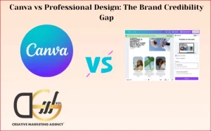
Why B2B Brands Are Abandoning Perfect Fonts
For years, the assumption in B2B marketing was that professionalism required perfection. Clean type meant credibility. Any deviation looked like a mistake.
That assumption is now a liability.
B2B buyers in 2026 are exposed to thousands of brand touchpoints daily. They can sense when a brand is templated. They notice when every competitor uses the same typeface, weight, and neutral palette.
Handwritten typography B2B and distorted typography breaks that pattern at a glance. It creates what designers call a moment of friction, a brief pause where the brain registers something different. That pause is attention. And attention is the most expensive thing in marketing.
The handwritten typography is also tied to a broader cultural move toward what is now called hyper-individualism in branding. Audiences, even professional procurement teams, are drawn to brands that commit to a voice. Imperfect letterforms communicate that commitment visually before a single word is read.
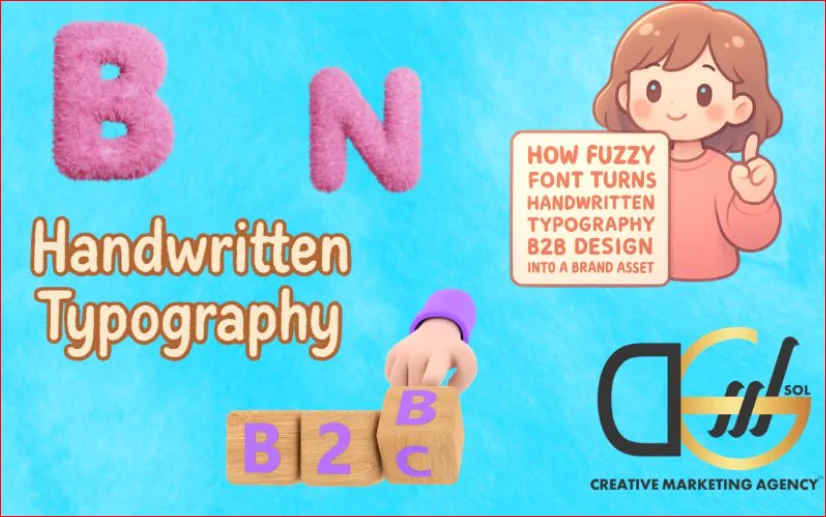
What the Fuzzy Font Strategy Actually Involves
The term fuzzy font is shorthand for a family of typographic choices that deliberately lean into imperfection. It is not about being sloppy. It is about being intentional with texture, inconsistency, and human irregularity.
The strategy includes several distinct approaches:
Distorted letterforms
Type that has been warped, stretched, or slightly corrupted. Often used in headlines and hero sections to create immediate visual impact. Works best when paired with clean body copy so the contrast does the heavy lifting.
True handwritten lettering
Custom script elements, not system fonts. These are either designed by a letterer or drawn and digitised. The irregularity is built in and unique to the brand. No competitor can replicate it exactly, which makes it one of the few genuinely ownable visual assets.
Worn and textured type
Fonts designed to look aged, pressed, or slightly faded. Common in heritage branding but increasingly used by newer B2B brands that want to project depth without the decades of actual history.
Mixed register typography
Combining a hand style with a technical or geometric face in the same layout. The tension between the two registers communicates both warmth and precision, which is exactly what most B2B buyers want to feel about a supplier.
Handwritten Typography B2B: Where It Works Best
Not every brand touchpoint is the right place for expressive type. The fuzzy font strategy for handwritten typography performs best when it is applied selectively and with purpose.
| Touchpoint | Best Use | What to Avoid |
| Website hero section | Headline or brand statement | Body copy or navigation |
| Pitch deck | Section openers and pull quotes | Data tables or financial slides |
| Social content | Caption overlays and story frames | Legal copy or small print |
| Printed collateral | Packaging, business cards, covers | Terms and conditions |
| Email headers | Brand name or campaign title | CTA buttons |
The table above shows that the handwritten typography teams use most effectively tends to sit at the top of the visual hierarchy. It sets the tone. It is not doing the functional work of communicating information. That is still the job of clean, legible type.
How to Build a Handwritten Type System Without Losing Consistency
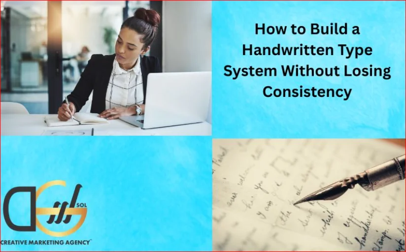
One concern that holds B2B brands back from this approach is the fear of inconsistency. If the whole point of the strategy is imperfection, how do you maintain a coherent visual identity?
The answer is to treat the handwritten typography element as a contained system with its own rules.
Start by defining the role the hand element will play. Is it the brand name only? Is it a family of accent words? Is it a recurring annotation style used across content? Whatever the role is, document it precisely.
Then establish usage rules just as you would for any other brand asset. Which weights and sizes are acceptable? What backgrounds does it sit on? What does it never appear alongside?
When campaign performance becomes part of the conversation, knowing how to track social media campaign success gives brands a clearer picture of their results. This makes it easier to determine whether their typographic choices are actually driving engagement or simply looking interesting.
This kind of discipline is what separates a creative experiment from a strategic brand system. The chaos is contained. The imperfection is consistent in its application even if it is irregular in its appearance.
The B2B Case for Hyper Individualism in Design
There is a version of this conversation that sounds like it belongs only in consumer branding. Luxury goods. Artisan food. Lifestyle products.
That is a narrow reading of what buyers actually respond to.
B2B purchasing decisions involve people. Those people carry the same psychological wiring as every other consumer. They respond to distinctiveness. They notice when a brand has a real point of view. They remember the pitch from the company that looked different to every other vendor in the review.
B2B brands deploy with this mindset, which is not about trying to look casual or craft-adjacent. It is trying to look considered. There is a meaningful difference between the two.
Considered design communicates investment. It says that someone at this company thought carefully about what they want to project. In a market where most B2B brands are built on downloaded templates and stock photography, that signal stands out sharply.
Avoiding the Common Mistakes
There are ways to get this wrong, and they are worth naming clearly.
- Using a handwritten system font rather than a custom or semi custom element is the most common mistake. Fonts like Pacifico or Caveat are overused to the point where they carry no distinctiveness at all. The whole point of the strategy collapses if the type looks like something anyone could apply in five minutes.
- Another mistake is applying the hand element everywhere. If every heading, subheading, caption, and label is in a distorted or script style, there is no contrast left for it to work against. The effect disappears into noise.
- Choosing a hand style that conflicts with the brand’s actual tone is also worth watching. A playful, bouncy script for a brand selling industrial compliance software creates confusion, not warmth. The hand element should amplify the existing brand personality, not introduce a new one.
For brands investing in campaigns built around this kind of visual identity, understanding how geo-targeted campaigns boost traffic for UK businesses becomes essential when scaling across regions. Campaigns that maintain consistent typographic branding across markets outperform those where visual identity shifts between markets.
How to Test Whether the Strategy Is Working
Typography decisions are not immune to performance measurement. A brand can have a strong intuitive sense that its visual identity is landing well and still benefit from actual data.
- The most practical testing approach for B2B brands is split testing on paid social and display. Run versions of the same ad with and without the handwritten element in the headline or overlay. Measure click rate, scroll behaviour, and downstream conversion.
- On the website side, heat mapping tools will show whether users are engaging with sections where the hand type appears or skipping over them. If they are pausing, the element is doing its job of creating friction and attention.
- In pitch environments, the feedback loop is longer but still available. Track which decks generate follow-up questions about the brand itself rather than just the product. That kind of question signals that the visual identity has registered.
From Trend to Brand Asset: Making It Last
A handwritten typography B2B strategy that exists only as long as the trend is not a brand asset. It is a decoration.
The brands getting the most value from handwritten and distorted type are treating it as a long-term commitment. They are commissioning custom lettering for themselves. They are documenting it properly. They are applying it with the same rigour they apply to colour and logo.
Over time, that consistency builds recognition. Audiences begin to associate the specific quality of a letterform with a specific brand. That is the moment when a design choice becomes a competitive moat.
B2B brands’ use of it as a long-term system is fundamentally different from brands that use it as a seasonal visual refresh. One is building equity. The other is renting attention.
Where to Start if You Have Not Done This Before
The barrier to entry is lower than most brands and marketing teams assume.
Begin with a single touchpoint. Pick one area of the brand where a handwritten or distorted element could sit without disrupting the broader identity. The email header is often the easiest starting point. It is high-frequency, regularly seen by decision-makers, and easy to test and iterate on.
From there, commission a single custom lettered word or phrase. The brand name, a campaign line, or a recurring category label. Have it drawn rather than generated. Live with it for a quarter.
If the response is positive and the team finds natural ways to extend it, you have the beginning of a system. If it does not fit, the experiment was contained and the learning is still valuable.
Why DGSOL UK Is Worth Considering for This Work
Brands looking for a creative partner who understands both the visual and the strategic side of this kind of work should take a close look at DGSOL UK. The team brings together graphic design, content, and digital marketing capabilities in a way that enables the creation of a type system and its deployment across campaigns without compromising coherence between the creative and commercial sides. We work with B2B clients who want design that performs, not just design that looks good in isolation.
Conclusion
The argument for handwritten typography that B2B brands should make in 2026 is not an aesthetic one. It is a competitive one. A clean, neutral, templated design is now the visual equivalent of a generic pitch. It communicates nothing distinctive. It creates no memory. It gives buyers no reason to choose one supplier over another based on brand alone.
Imperfect, human, considered typography does the opposite. It signals investment, personality, and a point of view. It creates the brief moments of attention that compound into brand recall. And when it is built as a system rather than a decoration, it becomes one of the most defensible assets a B2B brand can own.
Get in touch with DGSOL UK today to start building a visual identity that actually stands out.
FAQs
Is handwritten typography suitable for serious B2B industries like finance or legal?
Yes, when applied thoughtfully. A single custom-lettered brand element, paired with clean body copy, communicates both personality and professionalism without undermining credibility.
Does using imperfect type make a brand look less credible to procurement teams?
Not if the execution is clearly intentional. Buyers distinguish between careless design and considered design. Custom lettering reads as investment, not sloppiness.
How often should a B2B brand refresh its handwritten type elements?
A well-built system should not need frequent refreshing. Treat it as a core brand asset with the same longevity as a logo, not as a seasonal design choice.
Can small B2B businesses use this strategy without a large design budget?
Yes. The starting point can be a single commissioned word or phrase, which is far more affordable than a full brand identity project and still delivers real differentiation.
What does DGSOL UK offer for brands wanting to develop this kind of visual identity?
We provide integrated graphic design and digital marketing services, helping B2B brands build type systems and deploy them consistently across all channels from social campaigns to web design.